1. Explain what is QFD, (Quality Function Deployment)?
Quality Function Deployment (QFD) is an approach to product/service design and continual improvement that brings customers into the design process. It is used to translate what the customer wants into what the organization produces. QFD was originally developed by Dr. Yoji Akao in 1966, combining quality strategies with features of value engineering. QFD requires the involvement of all functional departments of the organization at the start of, and throughout the project. This is also a primary objective of TQM. QFD requires the organization to collect and analyze inputs from customers regarding attributes they would like in a product. QFD requires competitive benchmarking to compare customer satisfaction with the company’s current product versus competing products, and technical benchmarking comparing how the intended product will rate against that competition.
2. Explain the WHATs in a QFD matrix.
The WHATs in a QFD matrix describes developing the set of customer needs in the house of quality matrix. It can consist of the following:
Gathering Customer Needs Input: The premise of QFD is that before any product or service is designed, the producer should have a good understanding of his potential customers’ needs in order to improve the likelihood that the product or service will be a market success. The QFD team must work diligently to determine what potential customers would like to see in terms of attributes and features of the product and perhaps, what they don’t like about our current product. For any product category there are a number of ways, including focus groups, user groups, polling customers of existing similar products, surveys, and in any other way the organization can think of.
Refining the Customer Needs Inputs: Once the cross-functional QFD team has assembled sufficient information on what characteristics, attributes and features customers say they need, the information must be distilled into something useful. The data must be stored into a prioritized set of most important customer needs. Refining a large collection of data into something that represents the essence of the VOC is done through the analysis techniques of the affinity diagram, and QFD team discussion.
Using the Affinity Diagram: Affinity diagrams are used to promote creative thinking. They can be very helpful in breaking down barriers created by past failures and in getting people to give up ingrained paradigms that impede our ability to find new and different approaches. Affinity diagrams are used most appropriately when the following conditions exist when the issue in question is so complex and/or the known facts so disorganized that people can’t quite get the situation in control, when it is necessary to shake up the thought processes, get past ingrained paradigms, and get rid of mental baggage relating to past solutions that failed, when it is important to build a consensus for a proposed solution.
Using the Tree Diagram: Tree diagrams can be used for countless purposes. It will be used here simply to refine the affinity diagram results to make the list customer needs, or WHATs that will be placed in the HOQ. Although a tree diagram could go all way down into the nuts and bolts of a new design the new product, but to list the items to be addressed by the design team once the entire HOQ is completed. The final customer needs should be non-limiting and non-specific in terms of solution and measurement to allow the team to consider without bias all possible approaches to meet the needs.
3. Explain the HOWs in a QFD matrix
The Technical Requirements room of the HOQ states how the company intends to respond to each of the Customer Needs. It is sometimes referred to as the voice of the company. We must state at the outset that the technical requirements are not the design specifications of the product or service. Rather, they are characteristics and features of a product that is perceived as meeting the customer needs. They are measurable in terms of satisfactory achievement. Some may be measured by weight, strength, speed, and so on. Others by a simple yes or no, for example a desired feature, appearance, test, or material is or is not incorporated. The other side of the coin is that the technical requirements must not be limiting, but must be flexible enough to allow the company to consider every creative possibility in its attempts to satisfy the need. The technical requirements are generated by the QFD team through discussion and consultation with the Customer Needs and Planning matrices used as guidance. The team may use affinity or tree diagrams to develop, sort, and rank the requirements, similar to the Customer Needs development process. The difference here is that the input is from within the company rather than from external customers.
The Technical Requirements room of the HOQ states how the company intends to respond to each of the Customer Needs. It is sometimes referred to as the voice of the company. We must state at the outset that the technical requirements are not the design specifications of the product or service. Rather, they are characteristics and features of a product that is perceived as meeting the customer needs. They are measurable in terms of satisfactory achievement. Some may be measured by weight, strength, speed, and so on. Others by a simple yes or no, for example a desired feature, appearance, test, or material is or is not incorporated. The other side of the coin is that the technical requirements must not be limiting, but must be flexible enough to allow the company to consider every creative possibility in its attempts to satisfy the need. The technical requirements are generated by the QFD team through discussion and consultation with the Customer Needs and Planning matrices used as guidance. The team may use affinity or tree diagrams to develop, sort, and rank the requirements, similar to the Customer Needs development process. The difference here is that the input is from within the company rather than from external customers.
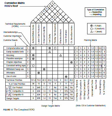
4. Explain the 1, or 3, or 9 interrelationship values in a QFD matrix
Now that we have the QFD team’s technical requirements (HOWs) in the HOQ, the next step is to examine how they relate to the WHATs of the Customer Needs. The results will be shown in the Interrelationships matrix, which links the HOWs and the WHATs. At each intersection cell of the inter- relationship matrix the team must assess the degree of relationship between the WHAT and the corresponding HOW. This is usually done using scales of significance of 1 to 5 or 1 to 9, with the higher number indicating a stronger relationship. Sometimes these numbers are entered, but often symbols are used. These symbols are used:
Now that we have the QFD team’s technical requirements (HOWs) in the HOQ, the next step is to examine how they relate to the WHATs of the Customer Needs. The results will be shown in the Interrelationships matrix, which links the HOWs and the WHATs. At each intersection cell of the inter- relationship matrix the team must assess the degree of relationship between the WHAT and the corresponding HOW. This is usually done using scales of significance of 1 to 5 or 1 to 9, with the higher number indicating a stronger relationship. Sometimes these numbers are entered, but often symbols are used. These symbols are used:
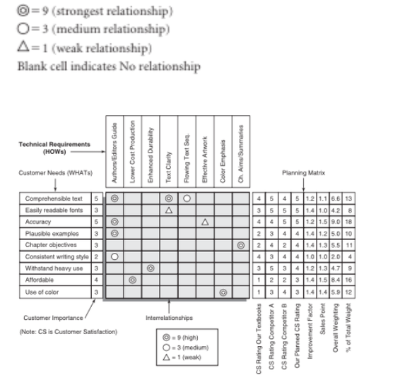
5. Explain how you calculate the technical priorities in the design target matrix.
To determine the relative importance, or priorities, of each of the stated Technical Requirements (HOWs) in meeting the Customer Needs (WANTs), the QFD team simply multiplies each of the interrelationship ratings of the technical requirements (0, 1, 3, or 9) from the Interrelationship matrix, times the corresponding customer need’s Overall Weighting value in the Planning matrix; and then sums the columns.
In the figure, starting with the technical requirement for a new and responsive set of Authoring/ Editing Guidelines, we find that its relationship to the customer need for a Comprehensible text was indicated in the Interrelationship matrix as a 9. There are three more Interrelationship values for the Authors/ Editors Guide technical requirement, so a total of four multiplications must be done and then summed.
Some QFD users translate the priority values into a percentage scale. This is done, of course, by dividing the individual technical priority values by the sum of all the priority values, and multiplying by 100.
6. Define statistical process control.
SPC originated in the work of Dr. Walter Shewhart at Bell Laboratories in 1931. Although, SPC was ignored in the West after World War II, Japan adopted it, subsequently developing it into total quality. SPC is a statistical method of separating special-cause variation from natural variation to eliminate the special causes and to establish and maintain consistency in the process, enabling process improvement. SPC is essential worldwide today to elevate the quality of products and services, while lowering costs, to compete successfully in the world’s markets. Continual improvement is a key element of SPC and total quality. SPC enhances the predictability of processes and whole plants. Elimination of waste is another key element of SPC. SPC can help improve product quality, while reducing product costs. SPC makes sampling inspection more reliable. SPC supports process auditing as a substitute for more expensive product inspection. SPC requires a capability in statistics, either in-house or through a consultant. Process operators should be key players in any SPC program. Understanding the process is a prerequisite to SPC implementation. All employees involved in SPC must be trained for their involvement. Measurement repeatability and reproducibility is essential for SPC.
SPC originated in the work of Dr. Walter Shewhart at Bell Laboratories in 1931. Although, SPC was ignored in the West after World War II, Japan adopted it, subsequently developing it into total quality. SPC is a statistical method of separating special-cause variation from natural variation to eliminate the special causes and to establish and maintain consistency in the process, enabling process improvement. SPC is essential worldwide today to elevate the quality of products and services, while lowering costs, to compete successfully in the world’s markets. Continual improvement is a key element of SPC and total quality. SPC enhances the predictability of processes and whole plants. Elimination of waste is another key element of SPC. SPC can help improve product quality, while reducing product costs. SPC makes sampling inspection more reliable. SPC supports process auditing as a substitute for more expensive product inspection. SPC requires a capability in statistics, either in-house or through a consultant. Process operators should be key players in any SPC program. Understanding the process is a prerequisite to SPC implementation. All employees involved in SPC must be trained for their involvement. Measurement repeatability and reproducibility is essential for SPC.
7. Explain control charts for variables, with a simple mathematical example.
Consider an example using x-charts and R-charts. These charts are individual, directly related graphs plotting the mean (average) of samples (x) over time and the variation in each sample (R) over time. The basic steps for developing a control chart for data with measured values are these:
1. Determine sampling procedure. Sample size may depend on the kind of product, production rate, measurement expense, and likely
ability to reveal changes in the process. Sample measurements are taken in subgroups of a specific size (n), typically from 3 to 10.
Sampling frequency should be often enough that changes in the process are not missed but not so often as to mask slow drifts. If
the object is to set up control charts for a new process, the number of subgroups for the initial calculations should be 25 or more. For
existing processes that appear stable, that number can be reduced to 10 or so, and sample size (n) can be smaller, say, 3 to 5.
2. Collect initial data of 100 or so individual data points in k subgroups of n measurements.
3. The process must not be tinkered with during this time let it run.
4.Don’t use old data—they may be irrelevant to the current process.
5. Take notes on anything that may have significance.
6. Log data on a data sheet designed for control chart use.
7.Calculate the mean (average) values of the data in each subgroup x.
8. Calculate the data range for each subgroup (R).
9. Calculate the average of the subgroup averages x. This is the process average and will be the centerline for the x -chart.
10. Calculate the average of the subgroup ranges R. This will be the centerline for the R-chart.
11. Calculate the process upper and lower control limits, UCL and LCL respectively. UCL and LCL represent the 3s limits of the
process averages and are drawn as dashed lines on the control charts.
12. Draw the control chart to fit the calculated values.
13. Plot the data on the chart.
8. Explain control charts for attributes, with a simple mathematical example.
The p-chart: Attributes data are concerned not with the measurement but with something that can be counted. For example, the number of defects is attributes data. Whereas, the x and R-charts are used for certain kinds of variables data, where measurement is involved, the p-chart is used for data are the friction defective of some set of process output. It may also be shown as percentage defective. The points plotted on a p-chart are the fraction of defective pieces found in the sample of n pieces.
Let us take the example of a pen manufacturer and make a p-chart. The pen makers already have gotten their defective pens down to 2% or less. If we pick it up from there, we will need several subgroup samples of data to establish the limits and process average for the chart. For attributes data, the subgroup sample size should be larger. We need to have a sample size large enough that we are likely to include the defectives (n=100). If the factory is makes 2000 pens of this type per hour and we sample the first 100 after the hour, in an 8-hour day we can obtain eight samples. Three days of sampling will give us sufficient data to construct our p-chart. Constructing the p-chart, we have several things to calculate: the fraction defective by subgroup, the process average, and the control limits.
9. Explain how can we use control charts for continual quality improvement?
Control charts of all types are fundamental tools for continual improvement. They provide alerts when special causes are at work in the process, and they prompt investigation and correction. When the initial special causes have been removed and the data stay between the control limits , work can begin on process improvement. As process improvements are implemented, the control charts will either ratify the improvement or reveal that the anticipated results were not achieved. Whether the anticipated results were achieved is virtually impossible to know unless the process is under control. An important thing to remember about control chartsis that once they are established and the process is in statistical control, the charting does not stop. Having done the initial work of establishing limits and centerlines, plotting initial data, and eliminating any special causes that were found, we have arrived at the starting point. Data will have to be continually collected from the process in the same way they were for the initial chart. The plotting of these data must be done as they become available (in real time) so that the person managing the process will be alerted at the first sign of trouble in the process. Such trouble signals the need to stop the process and immediately investigate to determine what has changed. Whatever the problem, it must be eliminated before the process is restarted. This is the essence of statistical process control. The control chart is the statistical device that enables SPC on the shop floor or in the office. This discussion of control charts has illustrated only the x -chart, R -chart, p -chart, and c -chart. Figure 18–19 lists common control charts and their applications. The methods used in constructing the other charts are essentially the same as for the four we discussed in detail. Each chart type is intended for special application. You must determine which best fits your need.
Control charts of all types are fundamental tools for continual improvement. They provide alerts when special causes are at work in the process, and they prompt investigation and correction. When the initial special causes have been removed and the data stay between the control limits , work can begin on process improvement. As process improvements are implemented, the control charts will either ratify the improvement or reveal that the anticipated results were not achieved. Whether the anticipated results were achieved is virtually impossible to know unless the process is under control. An important thing to remember about control chartsis that once they are established and the process is in statistical control, the charting does not stop. Having done the initial work of establishing limits and centerlines, plotting initial data, and eliminating any special causes that were found, we have arrived at the starting point. Data will have to be continually collected from the process in the same way they were for the initial chart. The plotting of these data must be done as they become available (in real time) so that the person managing the process will be alerted at the first sign of trouble in the process. Such trouble signals the need to stop the process and immediately investigate to determine what has changed. Whatever the problem, it must be eliminated before the process is restarted. This is the essence of statistical process control. The control chart is the statistical device that enables SPC on the shop floor or in the office. This discussion of control charts has illustrated only the x -chart, R -chart, p -chart, and c -chart. Figure 18–19 lists common control charts and their applications. The methods used in constructing the other charts are essentially the same as for the four we discussed in detail. Each chart type is intended for special application. You must determine which best fits your need.
10. Explain the way control charts could be used for quality improvements.
Control charts plays an extremely important role for quality improvements as they help in implementing statistical process control. Once the process is in statistical control, any change that is put into can be linked directly to any shift in the subsequent data. We can find out quickly what works and what doesn’t work. With the absence of special causes, it is now possible to observe the process unencumbered by external factors. The statistics expert, or consultant, can now help develop the appropriate control charts and calculate valid upper and lower control limits and process averages. Selection of the control chart type will be determined by the kind of data to be used. This describes the way control charts can be used for quality improvements.
Control charts plays an extremely important role for quality improvements as they help in implementing statistical process control. Once the process is in statistical control, any change that is put into can be linked directly to any shift in the subsequent data. We can find out quickly what works and what doesn’t work. With the absence of special causes, it is now possible to observe the process unencumbered by external factors. The statistics expert, or consultant, can now help develop the appropriate control charts and calculate valid upper and lower control limits and process averages. Selection of the control chart type will be determined by the kind of data to be used. This describes the way control charts can be used for quality improvements.
Social Networking Articles:
climate changes business can fix:
Business pioneers are currently going to cooperate to enhance atmosphere changing and it will help our surroundings from an Earth-wide temperature boost.
Article begins with "Most likely one of the strangest proclamations you hear in legislative issues these days is "I'm not a researcher." The thought, obviously, is that in light of the fact that lawmakers aren't atmosphere researchers, they're not qualified to say that environmental change is genuine". This is reality they don't think about those logical stuffs yet they are in the position of choice making. In any case this is not going to change until they give chances for qualified individuals in the field of environment science
SpaceX Might Be Next To Launch US Military Satellites:
SpaceX expected to wage a battle in court to be considered for the military satellite dispatches. It is perfect that they did, in light of the way that they're instantly a finalist for the contract.The United Dispatch Organization together — a relationship highly involved with Boeing and Lockheed-Martin — did not offer on the assignment, leaving space for SpaceX to possibly win the project.The ULA had been the go-to office for U.S. Flight based military dispatches consequent to 2006, yet the late confinement on Russian-made RD-180 rockets — which the ULA uses for its Chart book V — left the association without a sensible decision. With ULA out of the running, SpaceX is the principle other ensured possibility.Congress has issued phenomenal approval for the ULA to use Russian engines the workplace asked for before the blacklist — put set up in taking after Russia's 2014 augmentation of Crimea — and tried to favor the purchase of two or three.
Connect More Employees and Provide More Data:
There is persevering jibber babble about our related world: joined autos, joined homes and workers (inventively), even while in the midst of some preoccupation! Regardless of this, where availability truly matters, different affiliations are so far missing with pulled back pros and to an extraordinary degree low client closeness levels. Honest to goodness client and specialists affiliations require altogether all the more all around comprehension, far past key demographics and buy history. Joined operators is one who knows and understands the client and the affiliation, including its structure, things and associations. A basic bit of the refinement in the midst of specialists and clients starts from the shortcoming to get to and rapidly weave client information from various affiliation focuses, channels and frameworks into careful client data. Affiliations do workers a mischief by putting them before a nonsensically trained client with half (or even less) of their weaponry. Workers battle to react to client sales, discover answers, lift the going with solicitation for up-offer and give jump forward data to clients. Without client information as ammunition in the delegate's weapons store, affiliations can lose the fight for client perseverance. Given the massive number of businesses workers need to explore, and the measure of client information being made, it's reasonable why operators settle for not knowing. Clients however are still devotedly eating up information before going to the affiliation. Affiliations then must minimize the measure of employments and pregnant keeps as operators fight from application to application to react to clients who request moment answers. They require enormous data applications to offer workers some help with moving quickly through client information.
